THE ONSIDE GROWTH BRAND BOARD
On your side.
In every detail.
One example of a theme coming together. These are the colours, type and details that make our brand feel like us. Yours starts with what feels right for your business.
01 / THE FEELING
Warmth meets clarity
Thoughtfully made.
Clearly managed.
Calm confidence. A little character.
Plenty of room for what matters.
02 / OUR COLOURS
Plum / Mint ClarityA rich plum, a restrained mint and warm neutrals. Colour with purpose, rather than colour everywhere.
Plum
Our signature. Headings, key actions and the single-colour logo.
Mint
A fresh accent, used sparingly in graphics and details.
Lavender
Soft frames and quiet moments of colour.
Paper
A warm canvas with room to read and breathe.
Ink
Clear, comfortable reading for the information that matters.
Mint brings the accent. Ink and plum do the reading.
03 / OUR TYPOGRAPHY
Clear first. Character second.A clearer way
to grow.
Plus Jakarta Sans
Our everyday voice. Clean, open letterforms for headlines, body copy and useful information.
Aa Bb Cc Dd Ee Ff Gg · 0123456789A team on your side.
Caveat
A human touch for a short note.
A considered detail.
Georgia
An occasional editorial accent.
04 / OUR IMAGERY
Materials & craft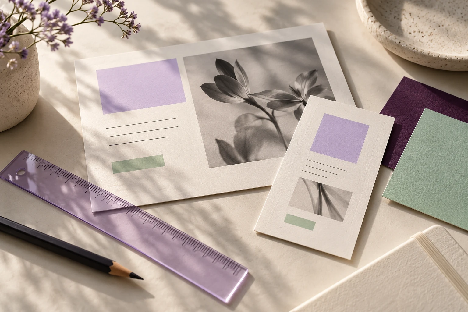
Warm light. Tactile details.
Ivory, paper and matte surfaces. Natural colour, gentle side light and a sense of care in the making.
05 / OUR GRAPHIC LANGUAGE
A human touch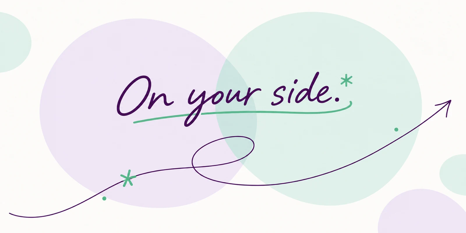
06 / OUR VOICE
Clear & consideredProfessional.
Approachable.
Always understandable.
We explain the work in plain language, make the next step clear and keep promises grounded in what we can do.
“Bring your website, advertising and SEO into a plan shaped around your business.”Start a conversation
- Clarity
- Connection
- Practicality
- Accountability
- Collaboration
07 / OUR LOGO
One identity. A few useful forms.



The O is our compact mark. Keep every logo’s original proportions, give it room and choose a version that stays clear against its background.